
Branding · Case Study · Pulso
Branding for Therapeutic Workshops
You hold space for other people’s stories — but who tells yours? Branding for therapeutic workshops is how facilitators and therapists build trust before a participant ever walks through the door. In this post, we’ll walk you through why it matters, how to do it step by step, and how we helped Pulso, a therapeutic writing workshop, build a brand people recognize and trust.
Why Branding for Therapeutic Workshops Matters
Your future participants will decide whether they feel safe with you long before the first session. They decide from your communication on social media, your flyers, your sign-up page. That first impression is your brand — whether you designed it or not.
Branding for therapeutic workshops isn’t about looking corporate or chasing trends. It’s the emotional and visual identity that communicates who you are and how it feels to sit in your circle. A clear brand differentiates your practice, attracts the participants who are genuinely aligned with your approach, and reflects your values back at the world.
Your Brand Should Reflect the Tone of Your Care
The way you show up visually should match the way you show up in the room. If your sessions are warm, unhurried, and human, a slick technical aesthetic will quietly contradict everything you say.
This is why we always start with understanding before creating. Before touching color or type, ask: what does someone feel in my workshop? Held? Energized? Expressive? Your brand’s job is to promise that feeling honestly — and then keep the promise.
Language matters as much as visuals. Therapeutic brands build trust with collaborative wording: “we’ll write together,” not “I’ll fix you.” Boundaries, warmth, and clarity in your copy model the same safety you offer in person.
For Pulso, the tone was intimate and a little nostalgic — words as a way home. Every design decision that followed had to pass one test: does this sound like the room feels?
The Psychology Behind Visual Identity
Visual choices are never neutral. Color, spacing, and typography all send signals — and for therapeutic work, those signals should say safe, grounded, human.
Think of it as trauma-informed design. Generous white space gives the eye room to breathe, the visual equivalent of an unhurried session. Grounded, warm palettes lower the temperature, while rounded, humanist typefaces feel like a voice.
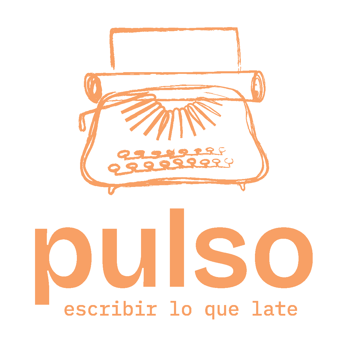
Illustration deserves special mention. A hand-drawn element instantly says a person made this — which is precisely the message a therapeutic practice needs. That’s why Pulso’s identity centers on an illustrated typewriter rather than a stock icon: it carries the texture of the practice itself.
None of this is decoration. Strategy shapes direction, and every visual element either builds trust or spends it.
How to Build a Brand for Your Therapeutic Workshop, Step by Step
You don’t need a marketing degree to do this well. You need honesty about your practice and consistency in how you express it. Here’s the process we use with every client — and the one we used with Pulso.
1. Define the Position of Your Practice
Start with a questionaire. Who is your workshop truly for? What transformation do participants leave with? And what makes your approach yours? Write the answers in plain language, as if explaining to a friend. That paragraph becomes your brand’s foundation: every color, image, and caption should trace back to it. Pulso’s answer was simple and specific: writing as a therapeutic practice, guided with warmth, for people processing life through words. Specificity is what makes positioning work.
2. Create a Visual Identity That Mirrors Your Energy
Now translate that positioning into visuals. Choose a palette that matches the emotional temperature of your sessions. Pick typography that sounds like your speaking voice. Find one signature visual element — an object, a texture, an illustration style — that could only belong to you. For Pulso, that was the typewriter: tactile, nostalgic, unmistakably about writing. Resist the urge to copy what other therapists are doing. Your energy is the differentiator; the identity just makes it visible.
3. Stay Consistent Across Every Touchpoint
Consistency is where trust compounds. Your website, social posts, workshop handouts, and email sign-offs should all feel like the same hand made them. Build a simple brand kit — logo files, palette, two typefaces, a few voice guidelines — and use it everywhere, without exception. AI tools can help you check structure and readability, but coherence comes from human judgment applied consistently.
Repetition isn’t boring. Repetition is recognition.
Common Mistakes in Therapeutic Branding
We see the same three mistakes again and again — and each one quietly costs practitioners the trust they’ve worked so hard to build.
Cold, Corporate Aesthetics
Many therapists default to “professional” and end up with clinical: navy blue, stock photos of handshakes, sterile sans-serifs. It reads as safe to the practitioner but distant to the participant. Your work is about warmth and humanity — a brand that feels like a bank waiting room contradicts it before you’ve said a word. Professional and warm are not opposites. Aim for both.
Vague Messaging
“A safe space for growth and healing” describes ten thousand practices. Vague messaging forces potential participants to do the work of figuring out what you actually offer — and most won’t. Say what you do plainly: therapeutic writing workshops for processing grief through words tells someone in one line whether you’re for them. Specific messaging doesn’t shrink your audience; it activates the right one.
Inconsistent Voice
Warm and poetic on Instagram, stiff and formal in emails, playful on flyers — each piece may be fine alone, but together they create doubt. In therapeutic work, coherence is credibility: participants are trusting you with their inner world, and a brand that keeps changing personality signals unpredictability. Write down three or four voice rules and apply them everywhere. Consistency is a clinical value expressed visually.
Case Study — Pulso: Building a Brand for Therapeutic Writing Workshops
Pulso is a therapeutic writing workshop where participants process their experiences through guided writing. The facilitators came to us with deep expertise and a loyal circle of participants — but no visual identity, no consistent presence, and real hesitation about “marketing” something so personal. Here’s how we built it together.
Pulso's Vision: A Typewriter at the Heart of the Brand
Every strong identity needs an anchor, and Pulso’s revealed itself in our first conversations: the typewriter. It captures everything the workshops are about — the physicality of writing, the rhythm of keys like a pulse, the sense that words are made, not just typed. We placed it at the core of the visual identity, so that a single image communicates the entire practice. When your anchor is that honest, everything else follows naturally.
What It Meant to Build an Identity for Their Business
For Pulso’s founders, branding wasn’t cosmetic — it was a shift in self-perception. Naming the practice, giving it a face, and treating it as a real business made the work feel legitimate to its own creators. That’s something we see constantly with therapeutic practitioners: the brand becomes permission. Once the identity existed, decisions that used to stall — what to post, how to present a new workshop — suddenly had an answer.
Personalized Illustration
We created custom illustrations for Pulso. Hand-drawn elements around the typewriter — loose lines, warm textures. Custom illustration also future-proofs the brand: no other practice can accidentally look like Pulso, because these images exist nowhere else.
The Confidence to Start Communicating
The most measurable change came after delivery: Pulso started showing up. With templates, a defined voice, and a visual system in hand, publishing stopped feeling like exposure and started feeling like expression. New participants arrived already understanding the vibe of the workshop. This is the underrated return on branding — not just how you look, but how confidently you communicate once you know how you look.
From Digital to Physical: One Brand, Every Touchpoint
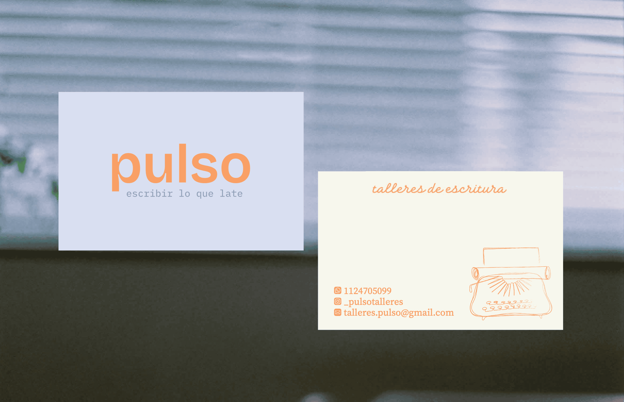
We envisioned extending Pulso’s identity across everything a participant touches. Notebooks and tote bags featuring the typewriter illustration could turn participants into quiet ambassadors of the brand. When someone writes in a Pulso notebook at a café or carries a Pulso tote through the city, the brand continues to live beyond the event.
Ready to Build a Brand That Feels Like Your Work?
Your practice already has depth. Branding for therapeutic workshops is simply the craft of making that depth visible — with intention and honesty.
At Tanto Creators, we build brands the way we built Pulso’s: understanding before creating, strategy before design, and a final identity that works everywhere from your website to the notebook in a participant’s hands. If you’re ready to give your practice the identity it deserves, let’s find your brand’s pulse together.